ParkLink is a speculative new rail network in the UK linking major cities to national parks aiming to reconnect those previously disconnected from the UK’s outdoor green spaces. National Parks in the UK are predominantly accessed by road, and the rail services that do operate to them are costly and unreliable. The ParkLink brand tackles this and the designed elements are there to educate and inspire.
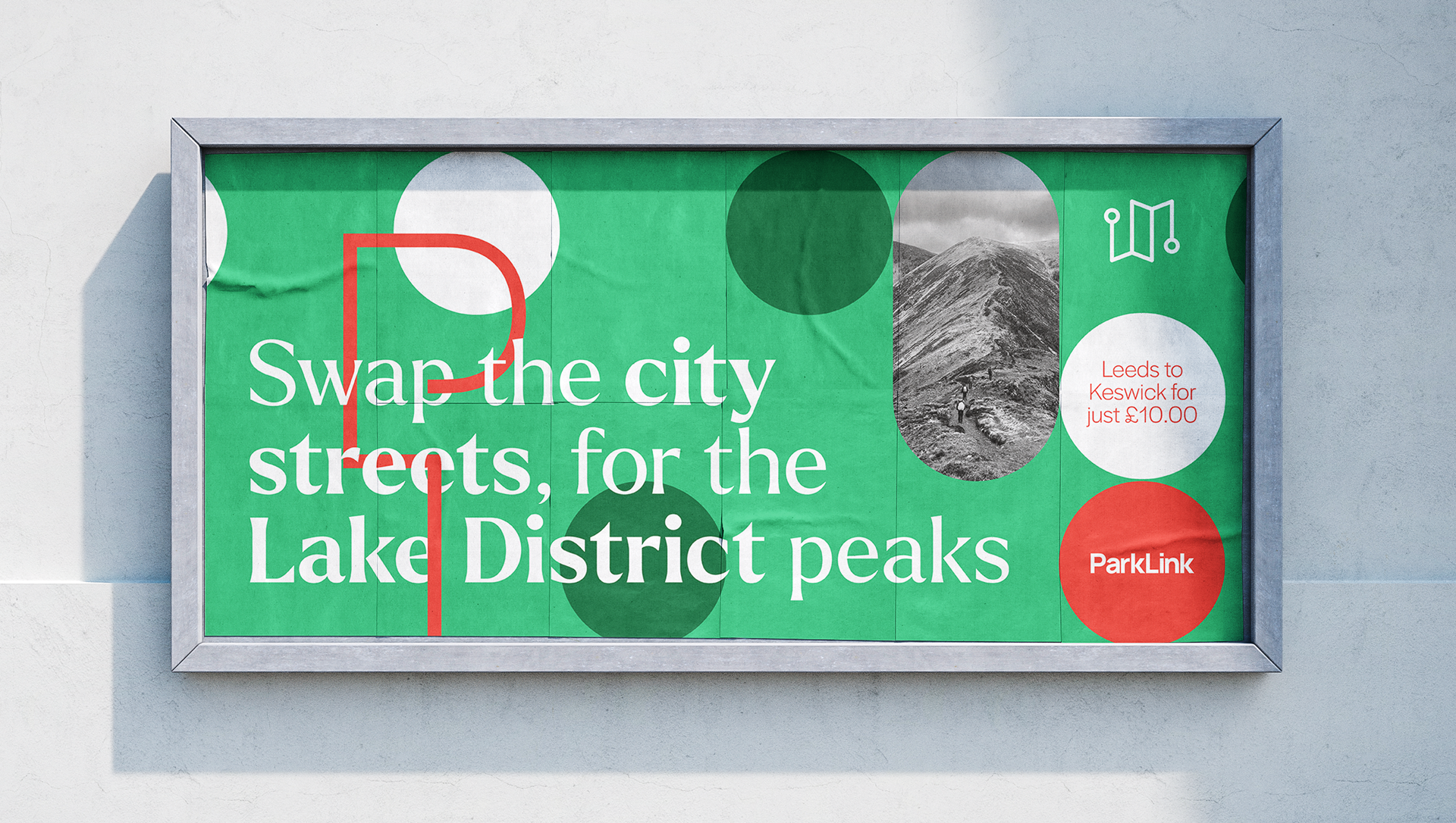
Promotional poster example for ParkLink to advertise the new service to those living in urban centres.
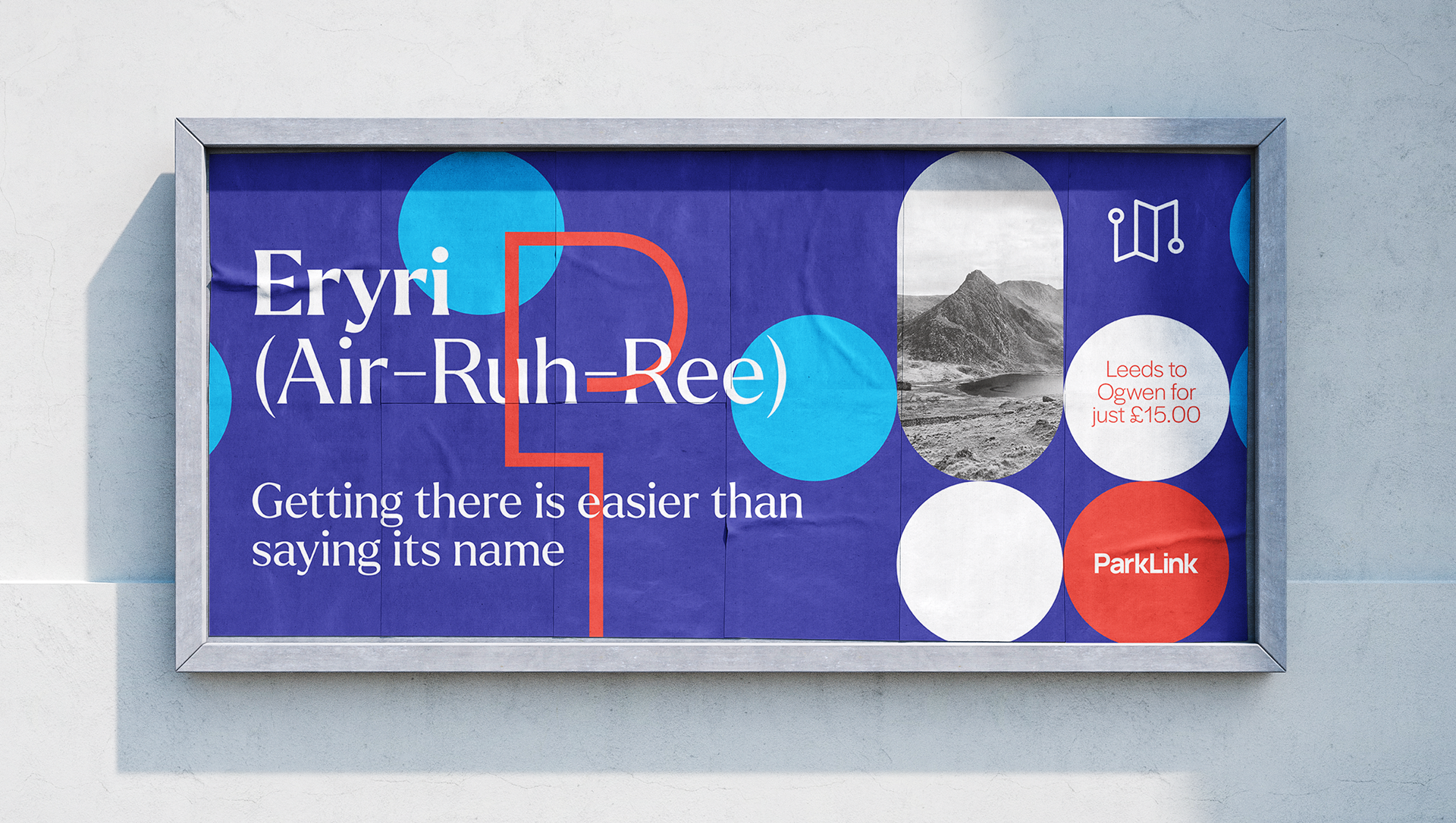
Promotional Poster Example

Visual Identity
The visual identity embraces contemporary youthful visuals whilst incorporating design elements from historic maps and guidebooks.
Promotional billboards are there to introduce the service, focusing on a playful tone of voice and application of the visual identity.
The key audience of ParkLink is people who have not had the opportunity to visit national parks previously. With this comes an education barrier, as they may not have the skills to read a map or enjoy these environments safely. The ParkLink pocket guides were created to tackle this.
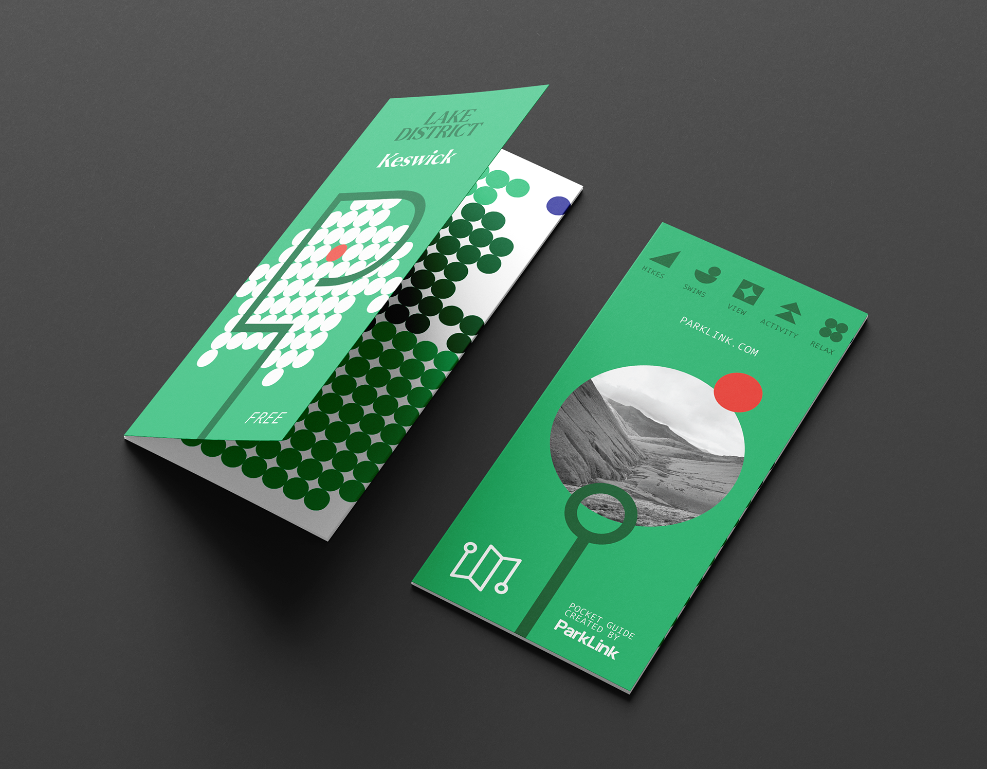
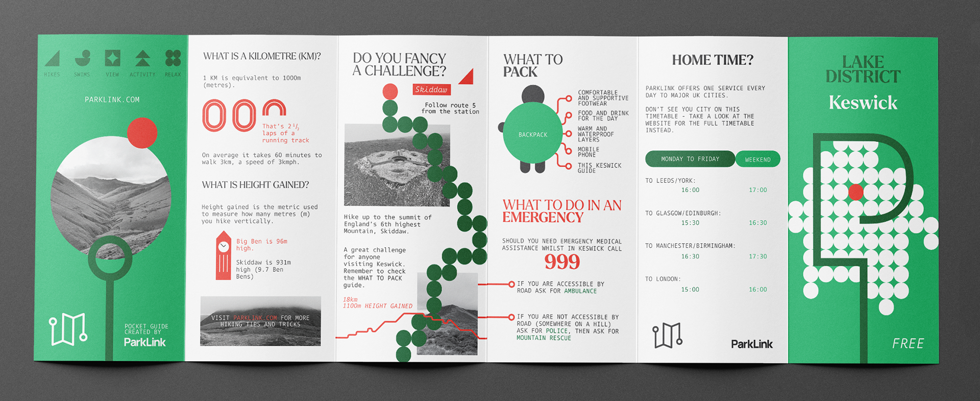

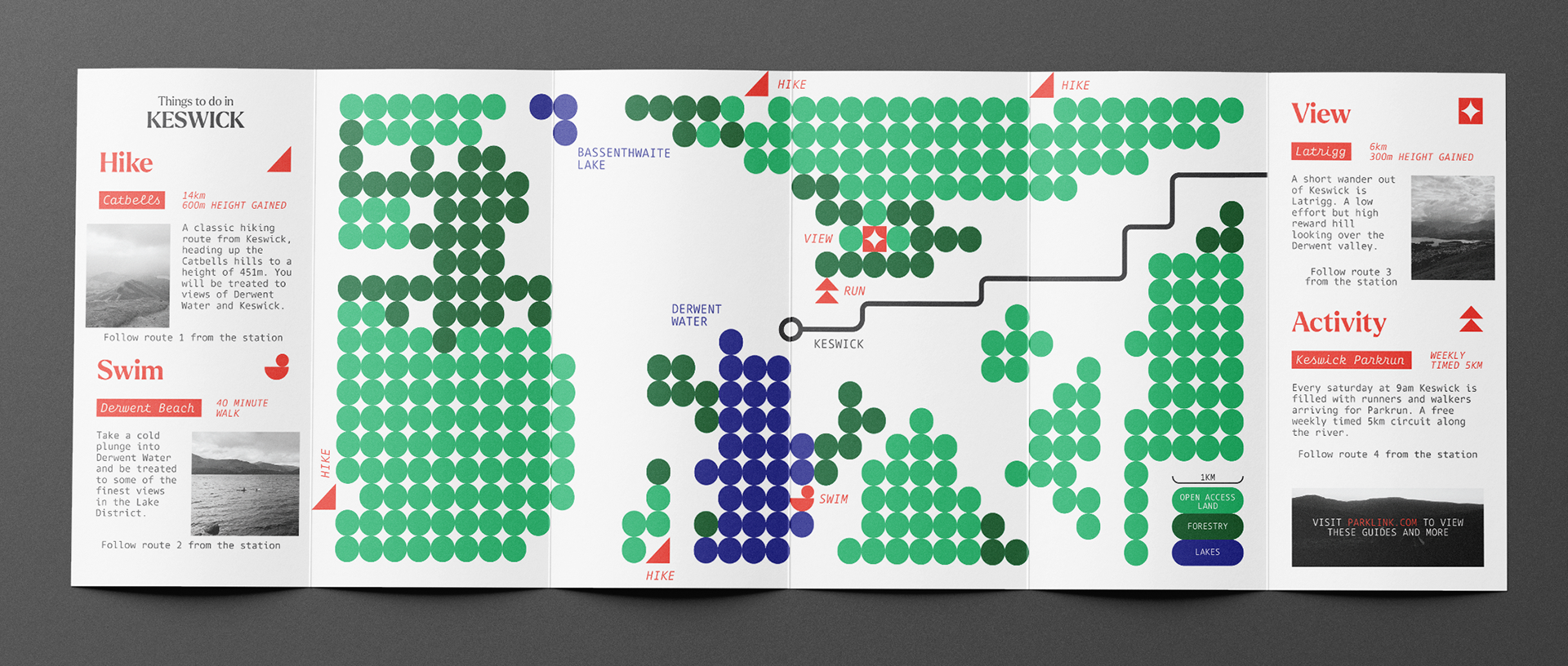


Features of the pocket guides are:
• Bespoke maps - designed to provide a holistic overview of the area requiring no taught knowledge of contours, compasses or grid references. Stripping the idea of a map back to basics to include only the essential elements.
• Icon system - used within the maps and general layout of the guide, designed to interact with external waymarking signage to increase accessibilty.
• Illustrated elements - working with text and photography to create balance and a clear content hierarchy within the guides.